Topic UI improvements
We released a bunch of improvements to make the topic UI more intuitive and easier to use. Most of the changes are self-explanatory, so we’ll cover here only the most important ones.
Navigating topic threads
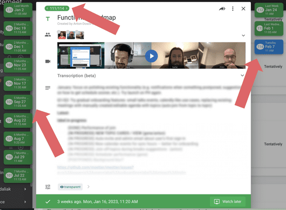
For recurring topics or one-time topics with follow-ups, we made it easier to navigate between previous and next instances of that topic. All the topics that happened before the current one you can see in the left column, and all the upcoming topics are in the right column.
We also introduced topic numbering to make it harder to get lost when there are many of them.
Follow-up button moved to the top
We also move the follow-up button to the right section of the topic dialog.
The same change was made on the meeting screen.
More compact topic cards
Topic cards on the timeline are much more compact so that more can fit onto the screen.
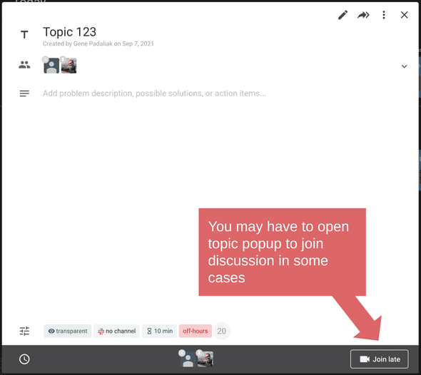
Previously, we had a JOIN button on every topic card on the timeline, and it was confusing some users causing them to join the wrong topics at the wrong times. Now, we only show the join button when you are expected to join.
You can still join other topics or join them sooner or later, but you’ll need to open the topic dialog to do that.


